Our brand guidelines serve as comprehensive instruction set designed to ensure consistency and coherence across all visual and communicative aspects of our brand.
Language
Dyalog Ltd is the company. Dyalog is our product. Dyalog APL is the language (variant of general APL).
Our Brand Colours
Copied!
Primary Colours
Primary
Retina Searing Orange
#ff6a13
rgba(255, 106, 19, 1)
Pantone 1585 C
Primary
Retina Soothing Lavender
#8986CA
rgba(137, 134, 202, 1)
Pantone 7446 C
Primary
Midnight
#003B5C
rgba(0, 59, 92, 1)
Pantone 302 C
Primary Shades and Tints
Secondary Colours
Secondary
Gunmetal
#2A3244
rgba(42, 50, 68, 1)
Pantone 19-4024 TCX
Secondary
Orange Peel
#FFA300
rgba(255, 163, 0, 1)
Pantone 137 C
Secondary
Rose
#CA2E51
rgba(202, 45, 81, 1)
Pantone P 59-15 C
Secondary Shades and Tints
Neutral Colours
Neutral
Lotion
#F2F1F0
rgba(242, 241, 240, 1)
Pantone P 179-1 C
Neutral
Raisin
#232222
rgba(35, 34, 34, 1)
Pantone Neutral Black C
The Dyalog Logo
Where possible, our company logo should appear in our orange. Where this isn’t possible, it can also be used in white. If the contrast is too low, it should be used in black. No other colours are permitted.
Clearspace and Margins
What’s the difference between clearspace and margins? In design and typography, ‘clearspace’ refers to the area surrounding a design element, such as a logo, that must remain free of other visual elements to ensure clarity and visual impact. ‘Margins’ are the spaces between the content and the edges of a page or container, creating a buffer zone that enhances readability and prevents text or images from being cut off.
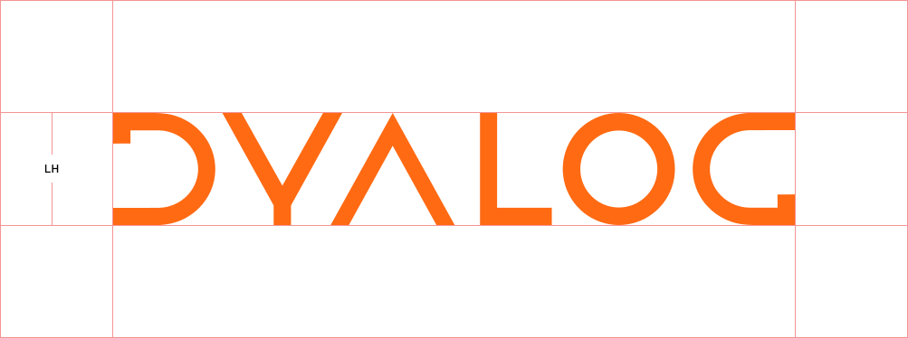
Clearspace: When using our company logo in a design, ensure it has sufficient clearspace and margins for optimal visibility. The logo’s clearspace is defined by the distance from the logo to any surrounding elements, using the logo height (LH) as a reference. For example, if the logo is 30px tall (LH = 30px), there should be at least 30px of clearspace around it on all sides to maintain its visual integrity and impact.
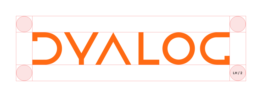
Margins: The logo’s margins are the space between the logo and the edge of the composition. When placing the logo, use half the Logo Height (LH/2) as the distance to the margin. This is the minimum allowed margin to ensure clarity, but the space can be increased if necessary.
For example, if the logo is 30px tall, the distance between the top and left sides of the logo and the edges of the composition should be no less than 15px.
Logo Dont's
We aim to maintain consistency throughout our branding, and our company logo should only be used as described above. Here are some examples that are not permitted!
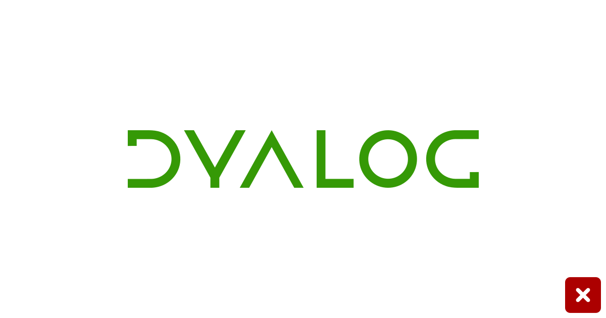
Don't use random colours
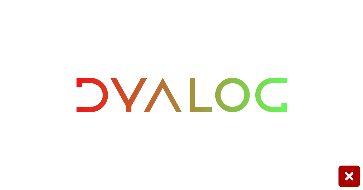
Don't use a gradient
No squeezing
No stretching
No tilting
No dropshadow
No outlining
No blurring
Dyalog Ltd Media Kit
If you plan to use any of our branding, please download our Media Kit. It includes various versions of our logo (in SVG and PNG formats) as well as our colour palette (in PDF format).
Specific Needs?
If you need more information or assistance with using our branding, or if you have a specific use case to discuss, please email us at media@dyalog.com, call +44 1256 830030, or send us a message.
Technical advice and assistance on all aspects of Dyalog usage is available by e-mail (support@dyalog.com) and/or telephone (+44 1256 830030 – limited to U.K. office hours). Limited advice on design and coding is available, but is not intended to replace the use of the printed and on-line documentation. Except when reporting an issue with the software, users are encouraged to seek advice from the user community via the Dyalog Forum (reading the content of the forums does not require membership).